Letterspace #40: Cecilia del Castillo Daza
23.06.2023
13.00 - 15.00
Grafische Werkplaats Amsterdam, NDSM plein 27, 1033 WC, Amsterdam
Doors open: 19.00 hrs
Start program: 19.30 hrs
Free admission & drinks
We count ourselves lucky that Cecilia del Castillo Daza is spending time in Amsterdam at the moment for an Erasmus exchange. Her research topic delves into a subject we had some prior knowledge of, but that we are eager to learn more about.
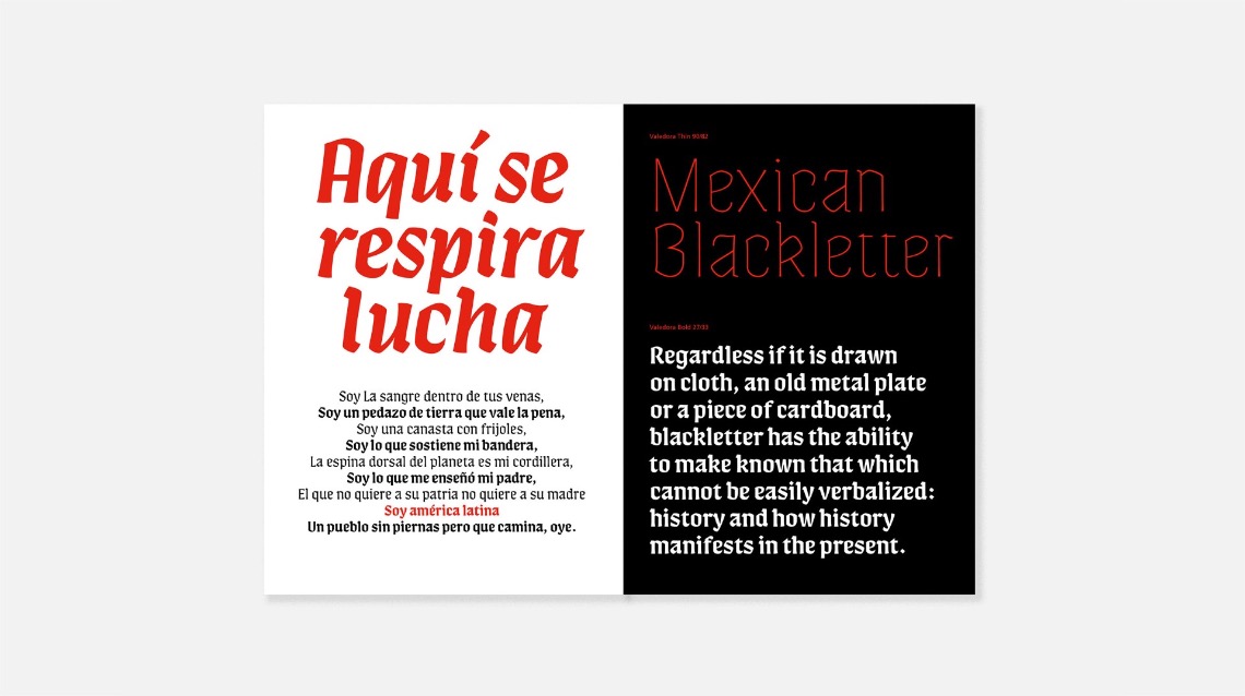
How come blackletters are popular in Mexican street culture and developed their own particular stylistics? Cecilia will also present two of her typefaces; Valedora that is inspired by her research and combines the Mexican Blackletter with Rotunda Gothic calligraphy and a new project developed during her time in Amsterdam.
Cecilia del Castillo Daza
Cecilia del Castillo is a Type Designer and Calligrapher graduated with a Master in Advanced Typography at EINA in Barcelona. She also obtained a diploma with distinction from TypeParis, in France, and a Diploma from Tipo G, Escuela de Tipografía de Barcelona. Cecilia first discovered her passion for letters by learning Calligraphy in Barcelona, a city that has opened its doors to her and has been her home for the last years.
Her life and efforts have been focused on learning and developing this craft. Her work as a Type Designer is strongly linked to her roots and her passion for Calligraphy. Mexico is always present: its richness and its colors. Letters are always at the heart of her work, either to tell a story or to become one with the image. She is currently part of the Mexican Type Foundry Typemade located in Monterrey Mexico.
Projects
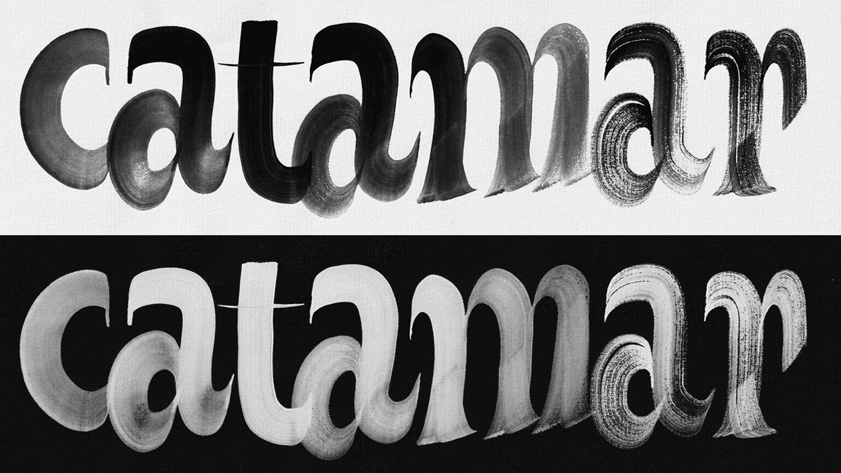
In this lecture, Cecilia is going to show 2 projects which are close to her heart. Both show in detail the process of calligraphic exploration behind them and the reinterpretation of those calligraphic shapes to a typographic system.
The first one is Valedora, a display typeface inspired by street signs of “Mexican Blackletter” and influenced by Rotunda Gothic calligraphy.
And the second one is a project in Collaboration with Sabina Chipară during an Erasmus exchange in Amsterdam, a typeface that takes its inspiration from letterforms found on a Dwiggins cover from 1937, combined with personal calligraphic explorations and Sabina’s great eye and experience to translate those shapes in an accurate midpoint between straight and precise shapes and gestural expressiveness.