What makes this project special?
“Every once in a while, an opportunity comes along for graphic design to make a positive difference to millions of people. These opportunities are so rare that they’re special by definition.” |
 Photo: Dan Bull
What was the objective of this project, and how does the design contribute to achieving this objective?
“15% of the world’s population – just over a billion people – has some kind of day-to-day disability. That’s a huge demographic, and it’s currently underrepresented and poorly considered across many areas of life the vast majority of people take for granted. Our aim with this project was to empower and celebrate the achievements of that 15% in the arena of sport, whether it’s in striving toward the Paralympics or simply for fun.”
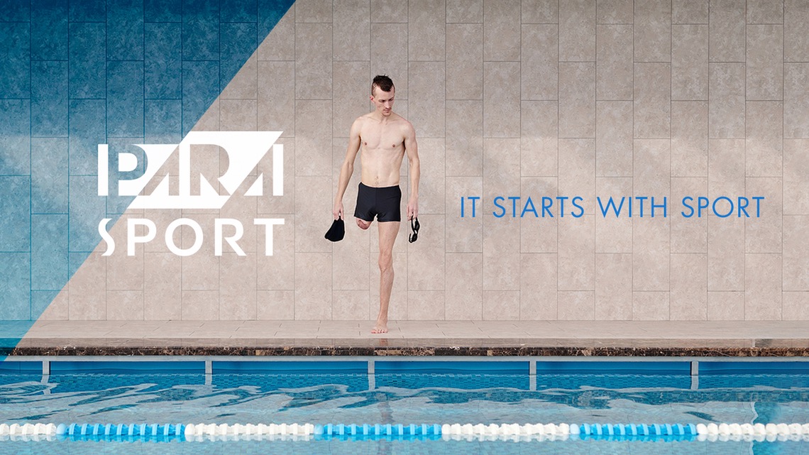
Photo: IPC PARA SPORT swimming pool
Can you tell us something about the (design) process?
“In some respects, this project resembles any other: we aligned with our client on their objectives, researched our audience and their as yet unmet needs, studied the visual language of sport, and set out to create a distinctive and meaningful brand that could be owned by PARA SPORT and their entire audience.
In other respects, however, this project was a real education for us. We committed to making the PARA SPORT brand accessible and relevant to 100% of people, regardless of their physical or cognitive ability, and this meant re-evaluating much of what we do. We consulted with our audience to ensure that our work remained accessible to all. For example, we created a suite of high contrast assets designed for the visually impaired and a soundtrack designed to be heard and felt by the deaf and hearing impaired.
We collaborated with the client and took inspiration from the visual language of sports to build a suite of assets that are beautiful, vibrant, and versatile, enabling an almost infinitely malleable pattern for use in super graphics and PARA SPORT spaces. The mark sitting at the centre of the brand takes its colours from the IPC brand, ensuring a visual connection between the Paralympic level and the world of sport that supports it. Also, it incorporates a diagonal motif which cuts through the mark at exactly 51 degrees, echoing the starting block that signifies the moment of beginning we want to encourage through PARA SPORT.”
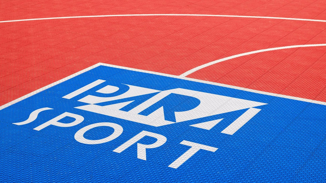
Image: IPC PARA SPORT court | Photography: Viktor Forgacs (Unsplash)
Were there any windfalls, pitfalls or setbacks while working on this project?
“We were pleasantly surprised at just how collaborative our clients were, and how they engaged completely with our vision for the brand. It was an entirely positive experience, characterized by a shared sense of purpose simply to do good.”
“It was an entirely positive experience, characterized by a shared sense of purpose simply to do good.”
– Dan Bull, ECD Design Bridge
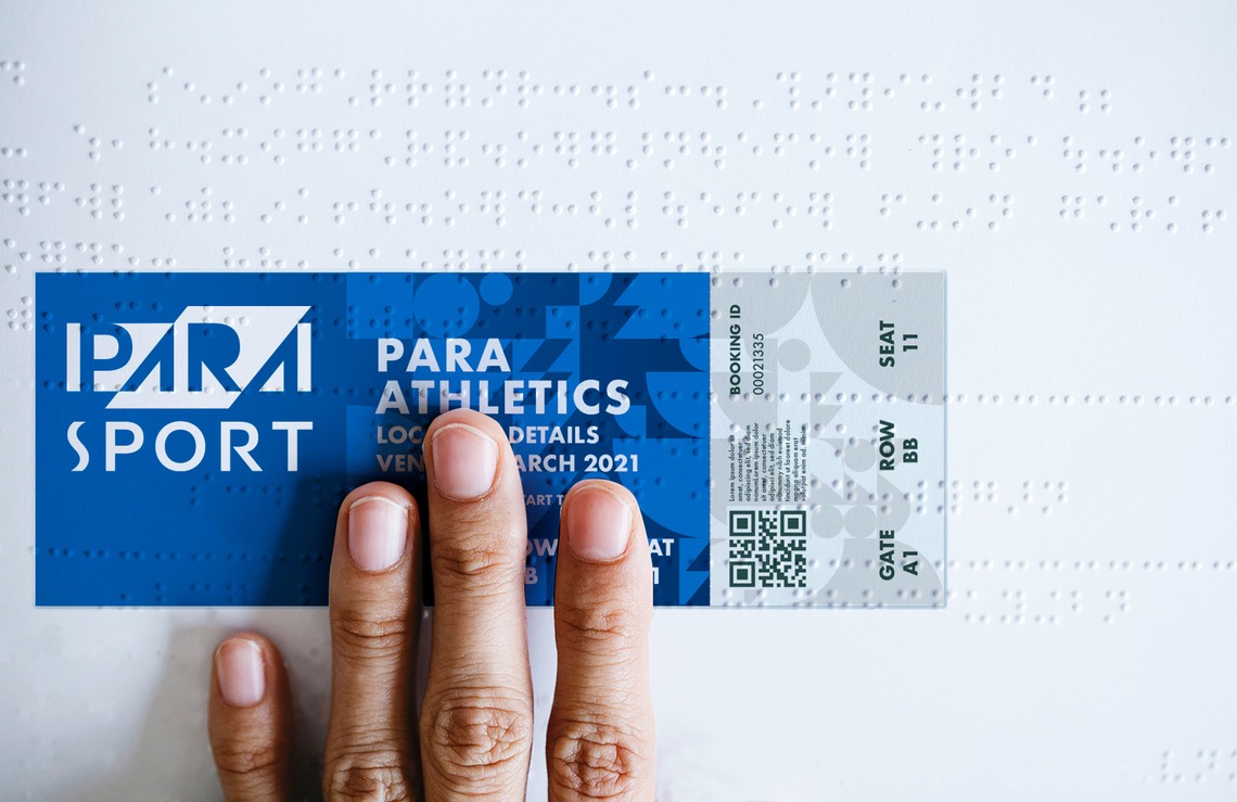
Photo: PARA Athletics tickets
Are you satisfied with your career steps to date? Do you have advice for other designers?
I’m the ECD at Design Bridge, of course I’m satisfied! In terms of advice for designers, I have three things:
Design is labour intensive, and you get out what you put in. Practise your craft.
Experience is like a spare screw — you never know when it’s going to come in handy. So absorb everything you can.
Don’t forget to play!